Every business decision, from pricing a product to predicting next quarter’s sales, rests on data. But not all data behaves the same way. Understanding the difference between categorical and numerical data is one of the most fundamental skills in business analytics — and getting it wrong can lead to flawed reports, misleading dashboards, and bad decisions.
In this guide, we’ll break down what categorical and numerical data actually mean, look at real business examples, and explain how each type is best visualized and used.
What Is Categorical Data?
Categorical data represents groups or labels rather than measurable quantities. It answers “what kind” or “which category” rather than “how much.” Categorical data is further split into two types:
- Nominal data: categories with no inherent order, such as customer gender, product type, or payment method (credit card, UPI, cash).
- Ordinal data: categories with a meaningful order, such as customer satisfaction ratings (poor, average, good, excellent) or employee performance tiers.
What Is Numerical Data?
Numerical data, also called quantitative data, consists of measurable values that can be added, averaged, or compared mathematically. It also has two subtypes:
- Discrete data: countable whole numbers, like the number of units sold or number of support tickets raised.
- Continuous data: values that can take any number within a range, like revenue, temperature, or time spent on a website.
Categorical and Numerical Data Examples
To make this clearer, here’s how the two data types show up side by side in everyday business scenarios:
| Business Area | Categorical Data | Numerical Data |
|---|---|---|
| E-commerce | Product category, shipping method | Order value, delivery time |
| HR | Department, employment type | Salary, years of experience |
| Marketing | Campaign channel, customer segment | Click-through rate, ad spend |
| Retail | Store location, product color | Units sold, footfall count |
These examples show that most real-world business datasets are actually a mix of both types — and successful analysis depends on treating each correctly.
Categorical vs Numerical Data: Business Examples in Action
Let’s look at how this distinction plays out in real decision-making:
Customer feedback analysis: A company collects survey responses where “satisfaction level” (categorical, ordinal) is analyzed alongside “time to resolve issue” (numerical). The categorical field tells you how customers feel; the numerical field tells you how efficiently the issue was handled. Combining both gives a complete picture of service quality.
Sales performance: A sales team might track “region” (categorical) against “monthly revenue” (numerical). While region tells you where the sales happened, revenue tells you how much was earned — and cross-analyzing the two reveals which regions are underperforming.
Inventory management: “Product category” (categorical) paired with “stock quantity” (numerical) helps businesses decide what to reorder and when, avoiding both overstocking and stockouts.
Categorical vs Numerical Variable: Why the Distinction Matters
In statistics and analytics, the term “variable” refers to any measurable characteristic in a dataset. Whether a variable is categorical or numerical determines:
- Which statistical measures apply. You can calculate an average or standard deviation for numerical variables, but not for categorical ones — instead, you’d use frequency counts or mode.
- Which chart types are appropriate. Mixing this up (like averaging zip codes) produces meaningless results.
- Which machine learning techniques work. Many algorithms require categorical variables to be converted into numerical form (through encoding techniques like one-hot encoding) before they can be used in predictive models.
Getting this distinction right at the data-cleaning stage prevents downstream errors in reporting and forecasting.
Categorical and Numerical Data Visualization
Choosing the right chart type is critical for accurate storytelling with data:
For categorical data:
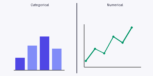
- Bar charts – compare frequencies across categories (e.g., sales by product type)
- Pie charts – show proportions of a whole (e.g., market share by brand)
- Stacked bar charts – compare sub-categories within categories
For numerical data:
- Histograms – show the distribution of a continuous variable (e.g., order values)
- Line charts – track trends over time (e.g., monthly revenue)
- Scatter plots – reveal relationships between two numerical variables (e.g., ad spend vs conversions)
When combining both types:
- Box plots – compare numerical distributions (like salary) across categorical groups (like department)
- Grouped bar charts – compare numerical values across multiple categories at once
Final Thoughts
Categorical and numerical data aren’t competing concepts — they’re complementary lenses for understanding your business. Categorical data tells you what is happening and where, while numerical data tells you how much or how often. Businesses that master this distinction build cleaner dashboards, run more accurate analyses, and ultimately make sharper, faster decisions.
Whether you’re building your first sales report or training a predictive model, start by correctly labeling your variables — it’s the foundation everything else is built on.